We found that customers value financial control. Leveraging this insight, we boosted our net transaction margins.
Role
End-to-end product design and testing
Brand
Zip Co NZ
Year
2023
Process snapshot 📸
This project details our journey to introduce a feature on Zip NZ's web checkout, enabling customers to pay beyond the standard 25% BNPL. At Zip, every initiative begins with a Product Requirements Document, and we progress from design to delivery in product trios comprising PM, Eng, and Design.
Ideation phase
We conducted continuous discovery interviews, talking to ≈2 customers per week that helped guide design decisions and direction.
Key learnings/goals in this phase:
Customers compared this solution to traditional lay buy - able to choose how much you want to pay at checkout
Paying more at a BNPL checkout wasn't an established pattern and we wanted to ensure experience was seamless and easy to comprehend
Feedback/friction would help customers avoid human error (paying more accidentally)
Decide on MVP, slider pattern, input field or both (after exploring other patterns)
Prototype
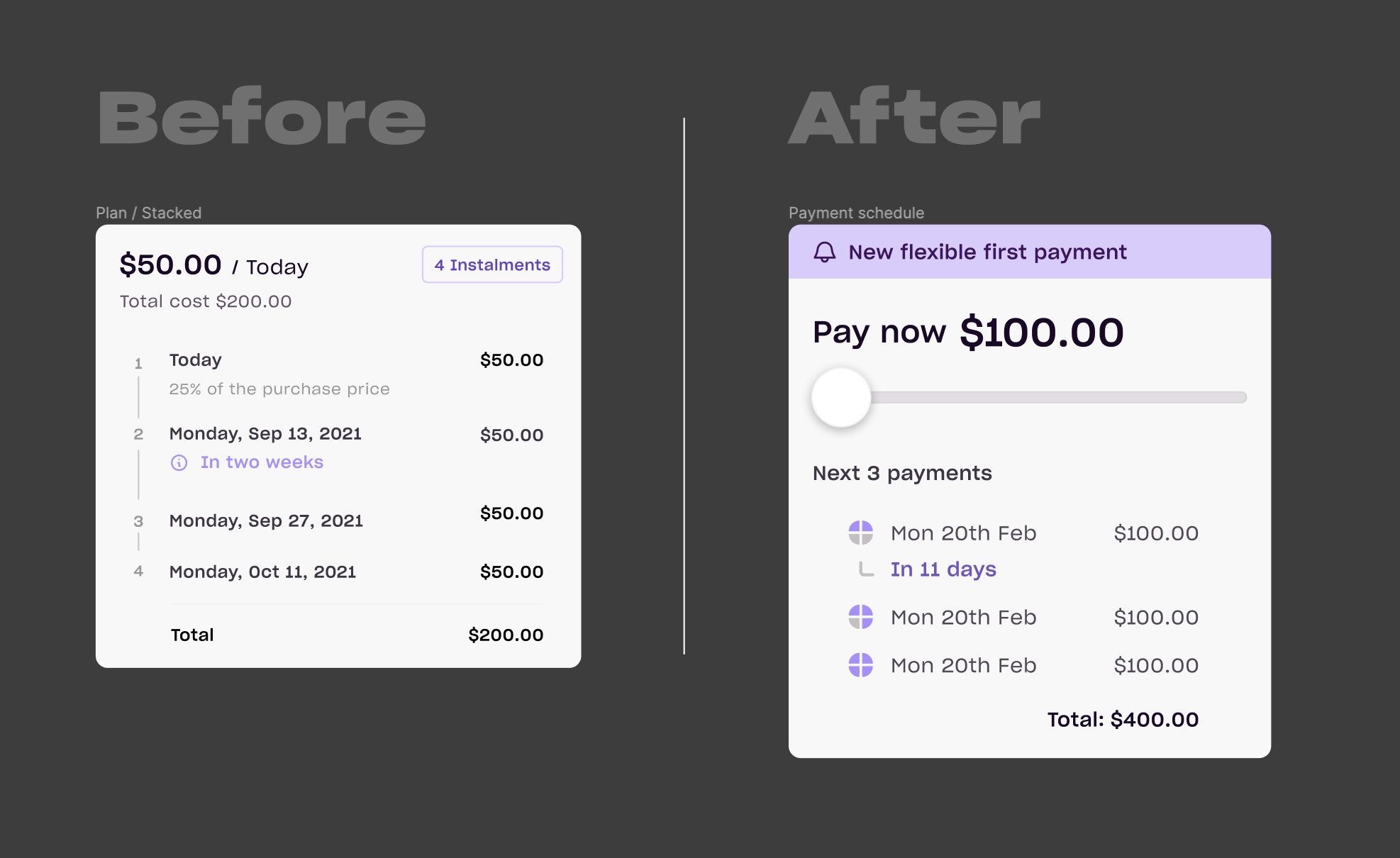
After design critiques and usability testing (Maze), this is how we changed the checkout component to accomodate the new 'pay more' functionality.
This is the component at checkout.
Going live
Before going live we:
Performed Internal staff tests using feature flags
Live production test to 10% of online traffic
Designed a survey to collect feedback from customers that used the feature (see example below)
We surveyed customers that used the new feature
Results 🍾
We positively impacted net transaction margins
≈8% of online checkouts resulted in customers paying >25% on first instalments (average 33% paid of total order value)
≈2% of online transactions paid in full
80%+ Qualtrics promotor score - customers that paid more at checkout feel more in control of their repayments
How was your experience paying more upfront
Survey responses
"Makes future payments easier to manage."
Fails 🫣
Some customers were accidentally paying close to 100% at checkout. Thankfully we were watching this feature closely and could quickly resolve.
We used a purple banner to highlight a new checkout feature. After its removal, transactions decreased. Reintroducing the banner reversed this, proving colour's impact on user attention and interactions.
Next steps
We're exploring how to adapt this feature for in-app, in-store payments. Given the existing friction of presenting a code in-store, ensuring a 'pay more' function is seamless, clear, and error-free is crucial.